Creating consistency with our marketing materials is always at the forefront of our minds, or at least it should be. It’s how we become recognisable to our customers and potential customers. And it’s also how we stand out from our competitors.
Creating a brand style guide is a great start as it keeps us on track. I create one for every logo design job and adher to it myself so I keep myself on track. It’s very easy for the designer in me to get carried away. And just because the design is nice, it doesn’t mean it’s right for the brand.
Coopers of Bingley was one of my very first jobs as Liz Hall Design, and one I’m still very proud of as I managed to create a very distinctive branding for Jo, owner of a local cleaning business.
After I designed the logo and website, Jo kept coming back to me for other marketing collateral – I’ve put together a mini case study to show the 8 different ways we built the brand, creating a very unique look which helped her business stand out from the crowd.
Logo design
Jo’s only request for a logo was to use the ‘C’ for Coopers as it held a sentimental reason for her. Otherwise the canvas was blank. The logo I created was very simple with a vintage feel and a touch of luxury which summed her up exactly.
Good to know – Don’t be afraid to inject your logo with your personality especially if you’re a sole trader and you are the business. You can continue the style with all your marketing (print, social media and website) and you’ll find it easier to create your business personality.
Business card design
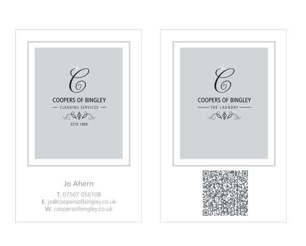
Inline with her branding, we kept Jo’s business card simple and uncluttered. She specified she wanted a QR code and we added this on the back. She also loves some bling and for special events she adds a tiny diamente to the sparkle on her logo to give it a luxurious feel.
Good to know – Business cards can work really hard for their money and have a huge potential to leave your mark with potential clients. For ideas take a look at my blog Ten creative ways to use your business card for marketing
Label design
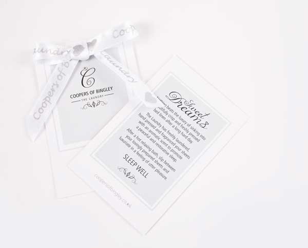
Jo had a laundry side to her business and wanted a label to use for free gifts for her customers. I suggested adapting the business card so this kept the consistency and we could keep costs lower too.
Good to know – Jo was happy for a new design for her labels but carefully designed, you can use your business card both as a business card and as a labels for freebies, products and samples. Always tell your designer your future business plans as it might affect the design.
Letterhead design
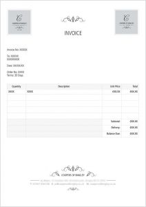
Jo used her letterheads for a price list, quotes and invoicing.
Good to know – A letterhead can be used for a million different things, it’s perfect for using when sending any information out to your customers, whether physical or digital. Create it in Word and use as a template so all your contact information is always easily accessible for your customer. Include your social media if you’re looking to increase followers.
Postcard design
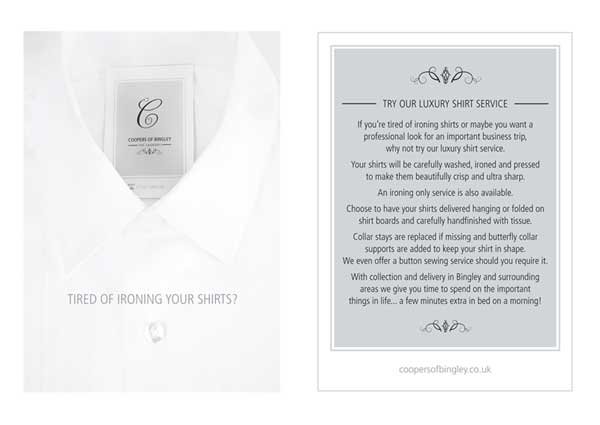
A postcard was needed for a leaflet drop and for general giveaways so we decided to an A6 postcard for a more luxury feel to stay consistent with the rest of the branding.
Good to know – A6 postcards are a popular size and a good alternative to the traditional A5 flyer as the are so useful. If you’re looking for some postcard or leaflet inspiration, take a look at my blog 5 design alternatives to the A5 flyer
Website design
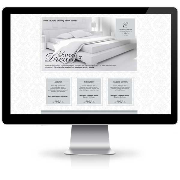
The website continued the clean and simple lines with a touch a luxury, and helped generate lots of website enquiries for Jo.
Good to know – Your website is where your potential customers may find you in a Google search or where potential customers might check you out having met you at an event or networking. Either way, it’s very important to give the right impression as we make the decision whether we like or dislike a website in 50 milliseconds. That’s 0.05 seconds. That’s not very long at all.
Social media graphics
Headers were created for both Facebook and Twitter which continued the Coopers of Bingley branding using her colour palette and photography which had been commissioned.
Good to know – Social media is how most of us stay in touch with our customers on a regular basis so it’s important you brand your pages correctly both visually and with your writing – it has to be consistent with your printed media and with your website.
Vehicle graphics
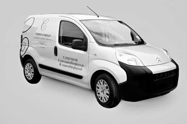
Jo knew she would get enquiries from having her van parked outside customers houses so wanted to use it as a promotional tool.
Good to know – Vehicle graphics can be a full vehicle wrap, a sticker in your back window or magnetic signs on your doors. See what works for you.
Feedback from Jo has been lovely:
“ I initially contacted LHD to help me design a business card/ logo. She immediately understood what I wanted. Very patient and nothing was too much trouble.
Many leaflets and one stunning website later I often recommend Liz to others.
A creative genius and and an absolute pleasure to work with.”
Interested in working with me? Get in touch!
Liz x

